
The Best AI Tools for Generating shadcn/ui Components in 2026
An in-depth review of how AI tools implement shadcn/ui: evaluating Radix UI primitives, Tailwind styling consistency, and design token integration.
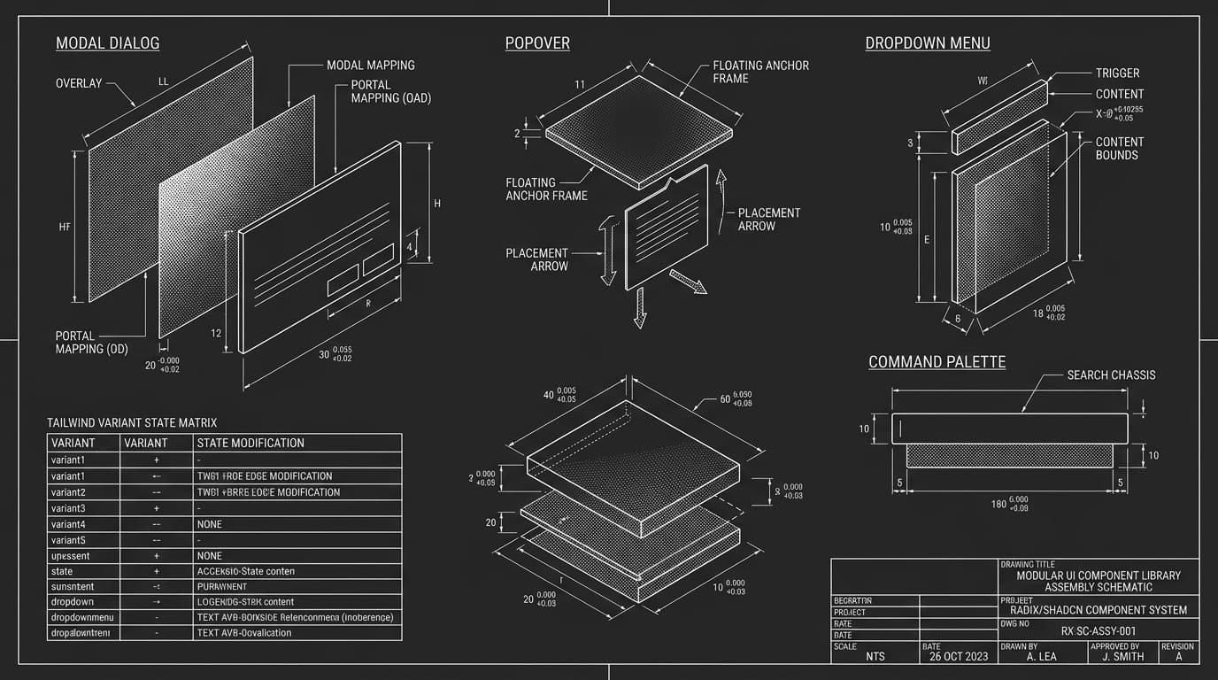
The Anatomy of a Production shadcn/ui Component
To understand how an AI tool handles shadcn/ui, you must understand the three foundational layers that make shadcn components work:
- ›Headless Accessibility Primitives (Radix UI): Provides battle-tested keyboard navigation, focus management, and ARIA attributes for complex components like dialogs, popovers, and dropdown menus.
- ›Atomic Styling (Tailwind CSS): Uses utility classes referencing semantic CSS variables (like hsl(var(--primary))) rather than hardcoded hex colors, enabling seamless dark mode switching.
- ›Variant Management (Class Variance Authority - CVA): Encapsulates component states (default, secondary, destructive, outline) and sizing into structured, type-safe variant definitions.
Reviewing Top AI Tools for shadcn/ui Generation
Not all AI tools understand shadcn/ui equally. Here is how the leading platforms handle component generation in practice:
v0 by Vercel: The Pioneer of shadcn Blocks
Because shadcn was created by Vercel’s design team, v0 was natively optimized for shadcn/ui from day one. It generates gorgeous isolated components with excellent default styling. Its primary limitation is that it focuses on single components rather than coordinating tokens across a complete full-stack application.
Orbit by Forion: Coordinated Design System Lock
Orbit takes shadcn/ui principles and expands them to full-stack applications. Through its Visual Persona System and Design System Lock, Orbit ensures that every generated shadcn component inherits the exact same color palette, border radius, and typography tokens across the entire application.
Code Example: Type-Safe CVA Variant Generation
import * as React from 'react'
import { Slot } from '@radix-ui/react-slot'
import { cva, type VariantProps } from 'class-variance-authority'
import { cn } from '@/lib/utils'

const buttonVariants = cva(
  'inline-flex items-center justify-center rounded-xl text-xs font-mono font-semibold transition-all focus-visible:outline-none focus-visible:ring-2 focus-visible:ring-ring disabled:pointer-events-none disabled:opacity-50',
  {
    variants: {
      variant: {
        default: 'bg-primary text-primary-foreground hover:bg-primary/90 shadow-sm',
        outline: 'border border-input bg-background hover:bg-accent hover:text-accent-foreground',
        ghost: 'hover:bg-accent hover:text-accent-foreground',
      },
      size: {
        default: 'h-10 px-5 py-2',
        sm: 'h-8 px-3 text-xs',
        lg: 'h-12 px-8 text-sm',
      },
    },
    defaultVariants: {
      variant: 'default',
      size: 'default',
    },
  }
)

export interface ButtonProps extends React.ButtonHTMLAttributes<HTMLButtonElement>, VariantProps<typeof buttonVariants> {
  asChild?: boolean
}

export const Button = React.forwardRef<HTMLButtonElement, ButtonProps>(({ className, variant, size, asChild = false, ...props }, ref) => {
  const Comp = asChild ? Slot : 'button'
  return <Comp className={cn(buttonVariants({ variant, size, className }))} ref={ref} {...props} />
})
Button.displayName = 'Button'
[ CROSS-REFERENCES · RELATED COMPONENT GUIDES & SOLUTIONS ]
Frequently Asked Questions
- [Q]Why does shadcn/ui not publish as an npm package?
- By distributing raw code instead of a black-box npm package, developers retain 100% control over the markup, styling, and dependencies, preventing package version conflicts and enabling easy AI refactoring.
- [Q]Can you use shadcn components in Expo React Native mobile apps?
- Standard shadcn components target the web DOM, but cross-platform builders like Orbit generate equivalent mobile primitives using React Native primitives and NativeWind styling for iOS and Android.
Build with Orbit AI Developer Workspace
Connect live databases, generate native Expo mobile codebases, and eliminate fragmented subscriptions inside one continuous environment.